Inside of you there are two domains, not wolves
Why I split my professional & personal site (and why it took 10 design iterations)
Written on June 18, 2024
Ahh, finally. A website that isn’t 7 months outdated and filled with [object Object] references from bad code I wrote a year ago.
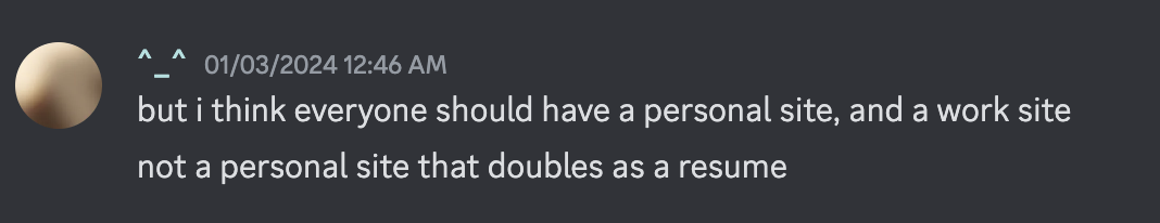
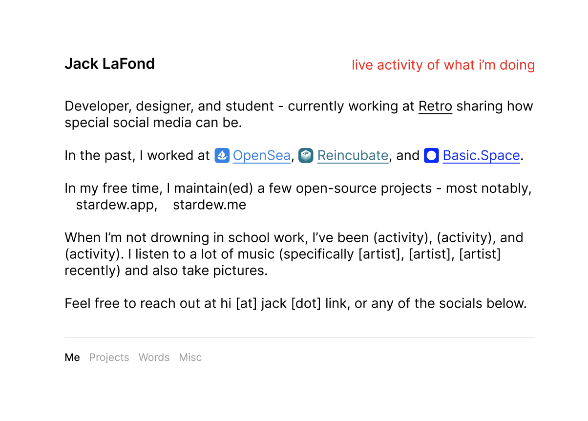
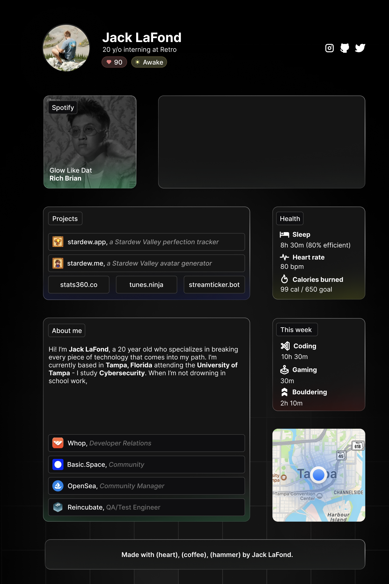
If you’re (blissfully) unaware, I’ve now split my personal site and my professional site into two separate domains: lafond.id for everything related to my professional work (such as my work experience, projects, and some related write-ups), and then this specific site (where I feature my hobbies, music, media consumption, and brain dumps).
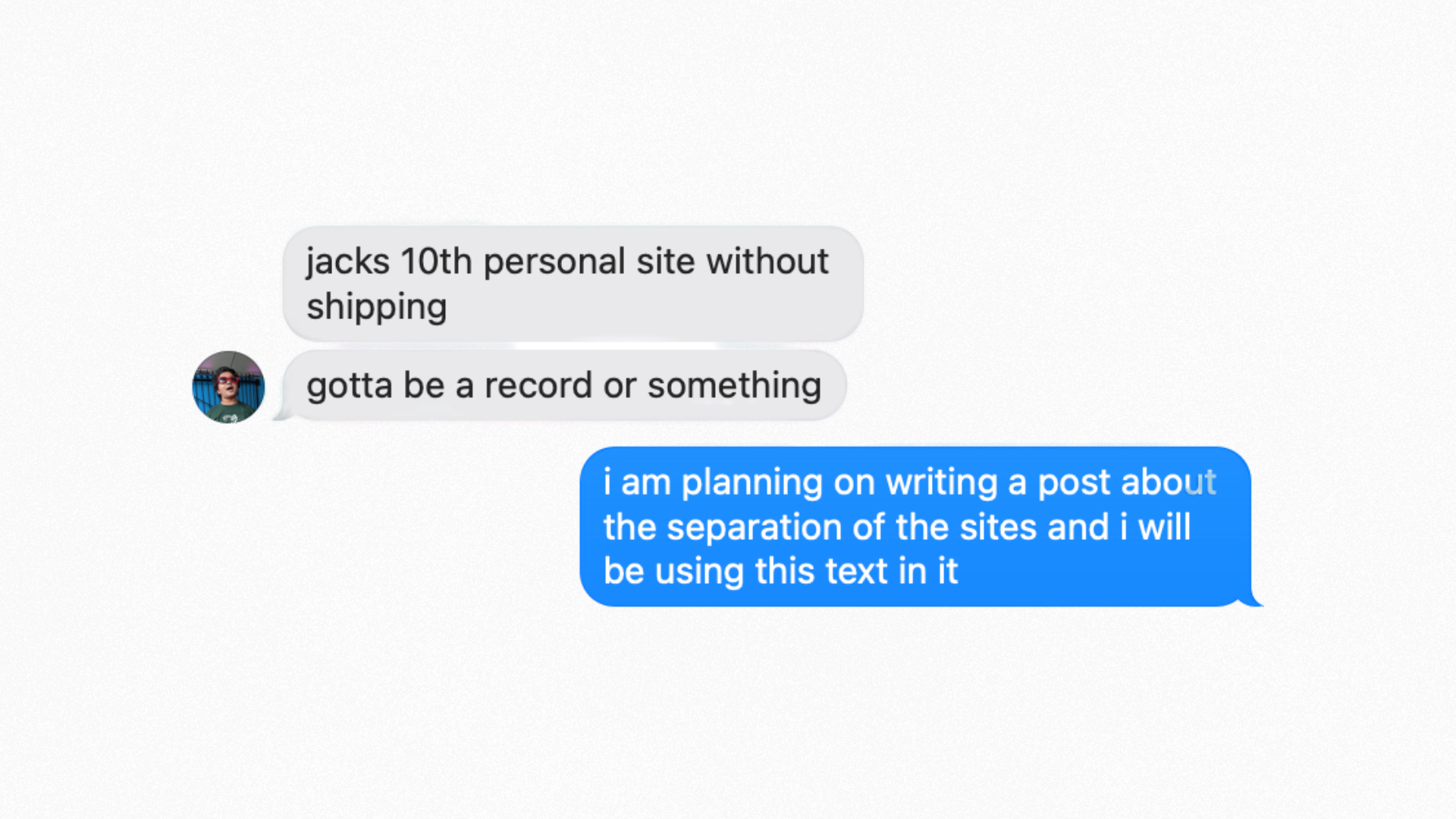
This idea started a few months ago when I was chatting with my friend Ayman about my nth personal site design. I was attempting to squeeze all of my projects, work experience, hobbies, music I listen to, and about every small micro-fact into me into a single-page site. As you can probably imagine, this didn’t go well.
Hm. Hadn’t really had that idea before!
The issue I faced was that I love sharing things about myself online, whether that be recent music I’ve listened to, or games that I hyperfixate on, or workouts that I’ve recently done. But Ayman was right in the fact that this was going to be shared with potential recruiters and employers, and they didn’t necessarily need to have that information.
So, after scrolling through Porkbun with a glass of watered-down-something-my-uncle-gave-me-in-Colorado, I decided to buy lafond.id & finally make the split between my personal and professional portfolios online.
Well, that would be if I could settle on a design.
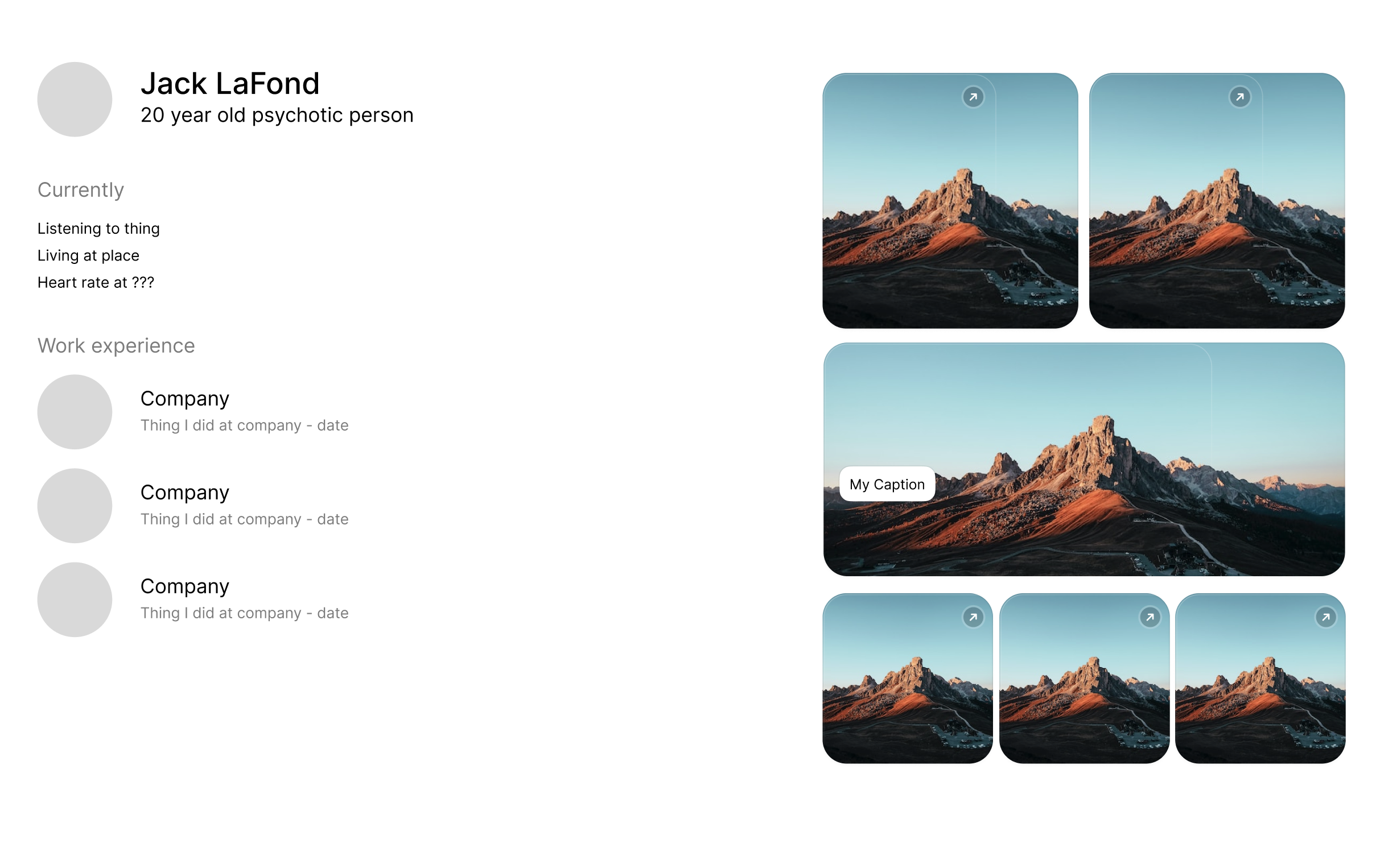
The personal iteration on the iteration on the iteration on the.. you get the point
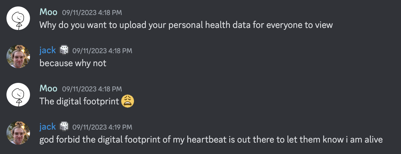
Sorry Moo. At one design iteration I wanted my heartbeat from my Oura ring. Probably a bad idea.
It turns out that being friends with wonderful web developers (Alistair, Ari, Neesh) leaves a lot of room for imposter syndrome. And then you go on Twitter and see everyone else’s portfolios, and then you don’t even bother trying to finish a portfolio in the first place.
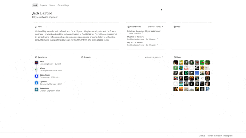
In the end, I finally settled on something Incredibly Simple™ with a little bit of pop and pizzazz along with it. The site features a very pretty mix of serif & sans serif fonts, a small splash of color in the redirect to my professional portfolio, and the final touch: a Steam Library-inspired hover effect for displaying my recently listened to albums and games played. It’s the first iteration that I’ve felt like gives me room for growth (I want to eventually add a dedicated blog and posts page, along with more media types) without necessarily cramping up with all of my professional work.
So what now?
You can expect more (casual) posts from me. I really enjoy short, medium, and long form writing and especially in a technical form. I’ll eventually iterate on the internal infrastructure of the site (I’m using really outdated personal API endpoints for the music & games portion), then open source it all!
The site is very me. And that’s what I like about it. The web is an incredible place to get inspiration but also demotivated - and I’ve finally feel like I’ve begun to build a shelf where I can show that I’m more than just a GitHub commit graph.. or something like that.
Designs I Made: Director’s Cut
Anyways, if you’re interested in what the past iterations looked like… enjoy.
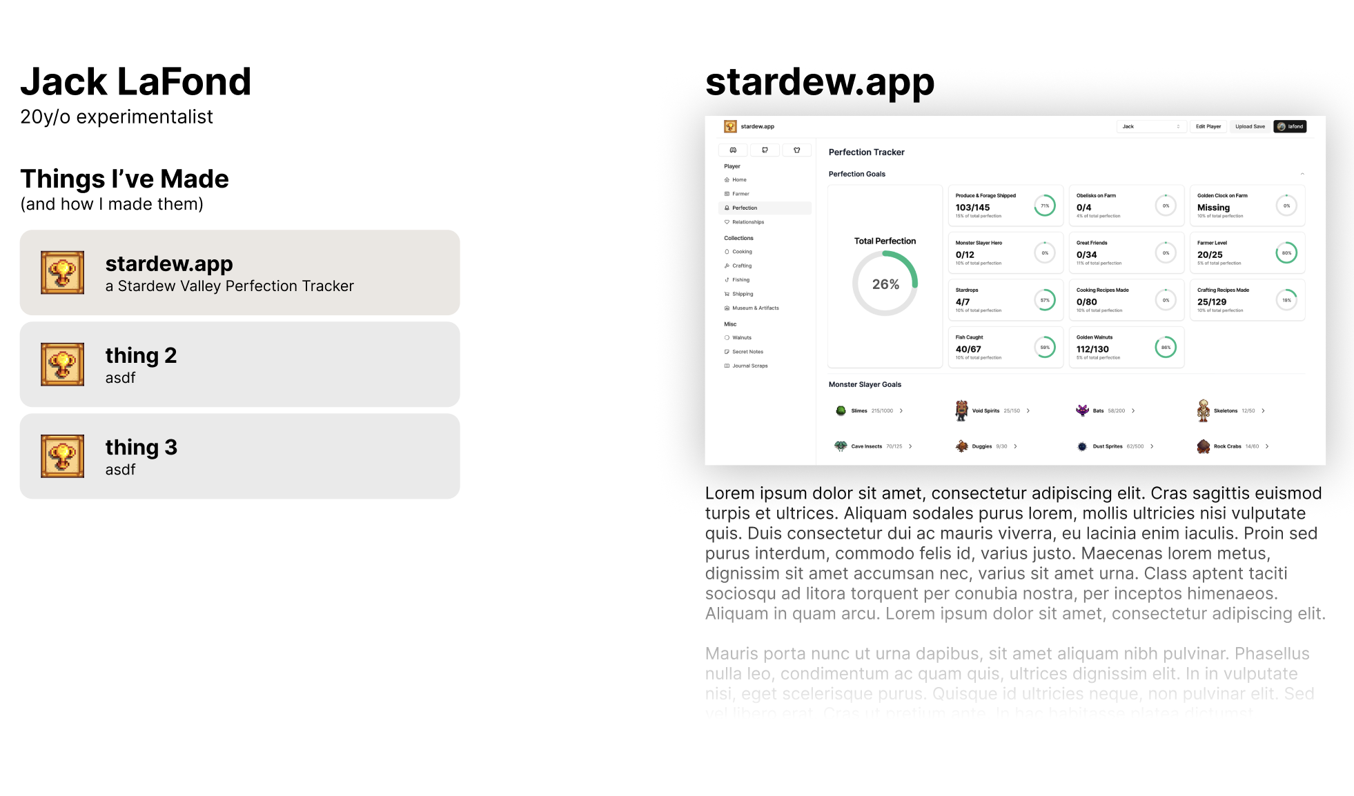
This one actually needs to be featured first - I completely built and completed this website, (and again, it looks quite similiar to what we’re on right now), but it was more of my first experience with Astro and not something I planned on finishing. But the fact that I went through the whole hoop jump to get everything set up is quite silly, so I figured I’d feature it first.
Not the worst of the bunch. I think I was kind of cooking on the vision with the bottom bar, but in the end I felt like it was very condensed in the middle of the page and scrapped it.
This one didn’t make it out of Figma for a reason, but it actually I think was ahead of it’s time - Gavin Nelson’s new site actually looks like what I was going for, but probably executed far better than I ever could do.
No idea what I was thinking here. Ignore it.
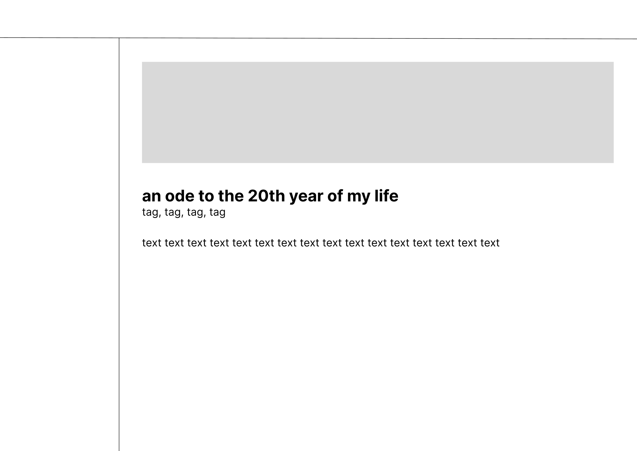
This one was… okay? I mean I think I was getting closer to trying to fill the page with content and still be descriptive with images and whatever else but.. feel like I missed the mark with it.
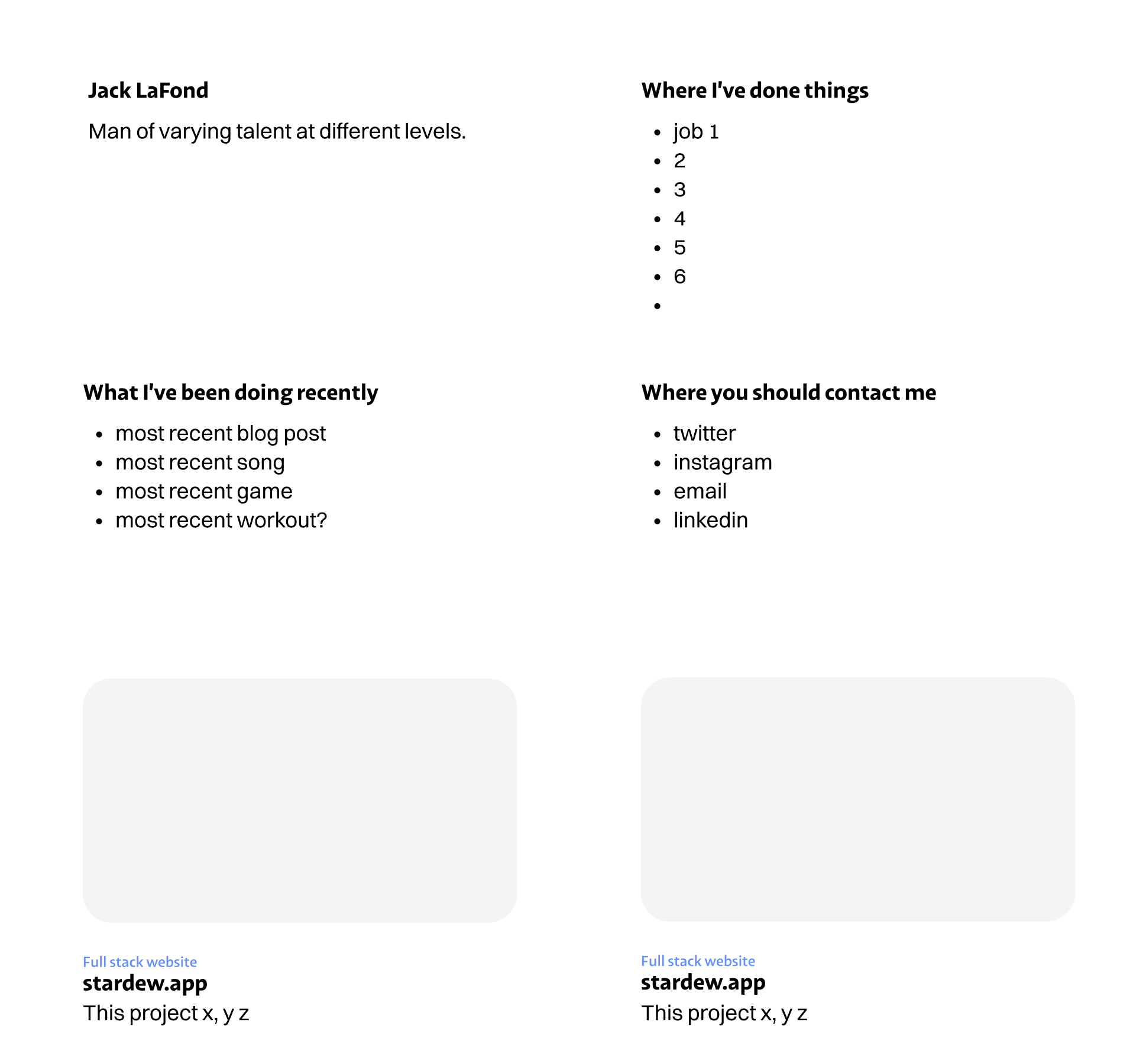
Immediately following Iteration #4, I went again for trying to be descriptive and minimal with a pop of image. I think the bento box design was supposed to be for various boxes I’d fill, which you’ll see riiiiiiight…
Here. This design was heavily inspired by 5/9’s website, and I actually ended up designing and developing the majority of this with my good friend Miguel! Towards the end I got busy, and the more I revisited it, the more I disliked the vision of the long term design. So it got scrapped.